Features
Not everyone wants to build their own UI components
But every product should have a great design.
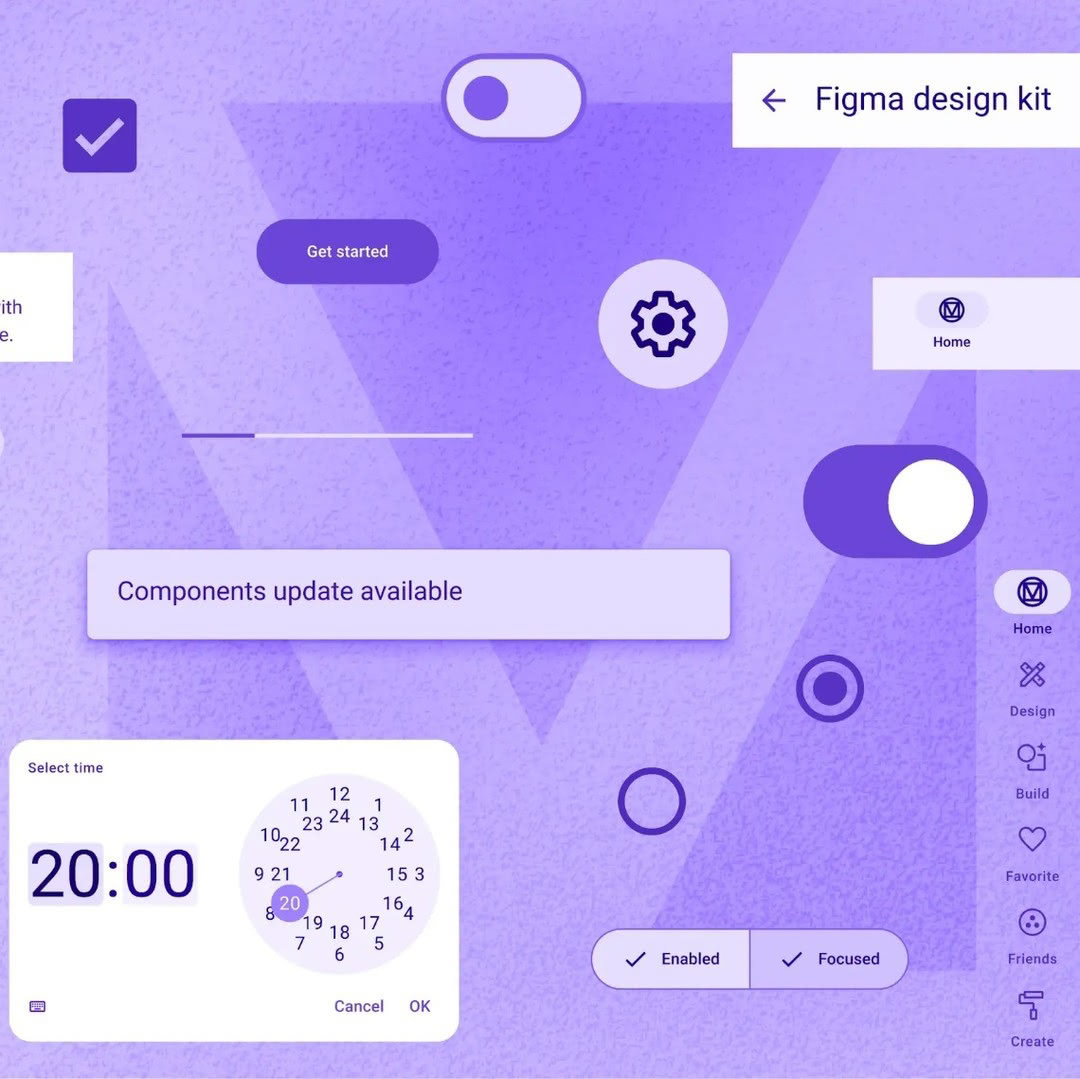
Make your product shine
Stand out from the crowd with an award winning design system. Material components arn't just functional, they are beautiful.
Unbelievably easy to develop with
There has never been an easier way to build a Material design product. Slint's simple syntax and powerful tooling will have you shipping in days.
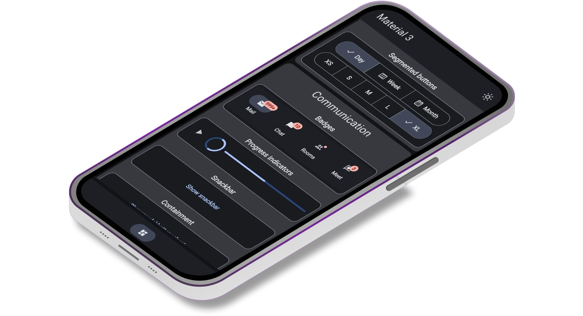
10 years in the making
Build your product with the worlds most used design system. It's been the foundation of Android phones since 2014 and proven in billions of devices.
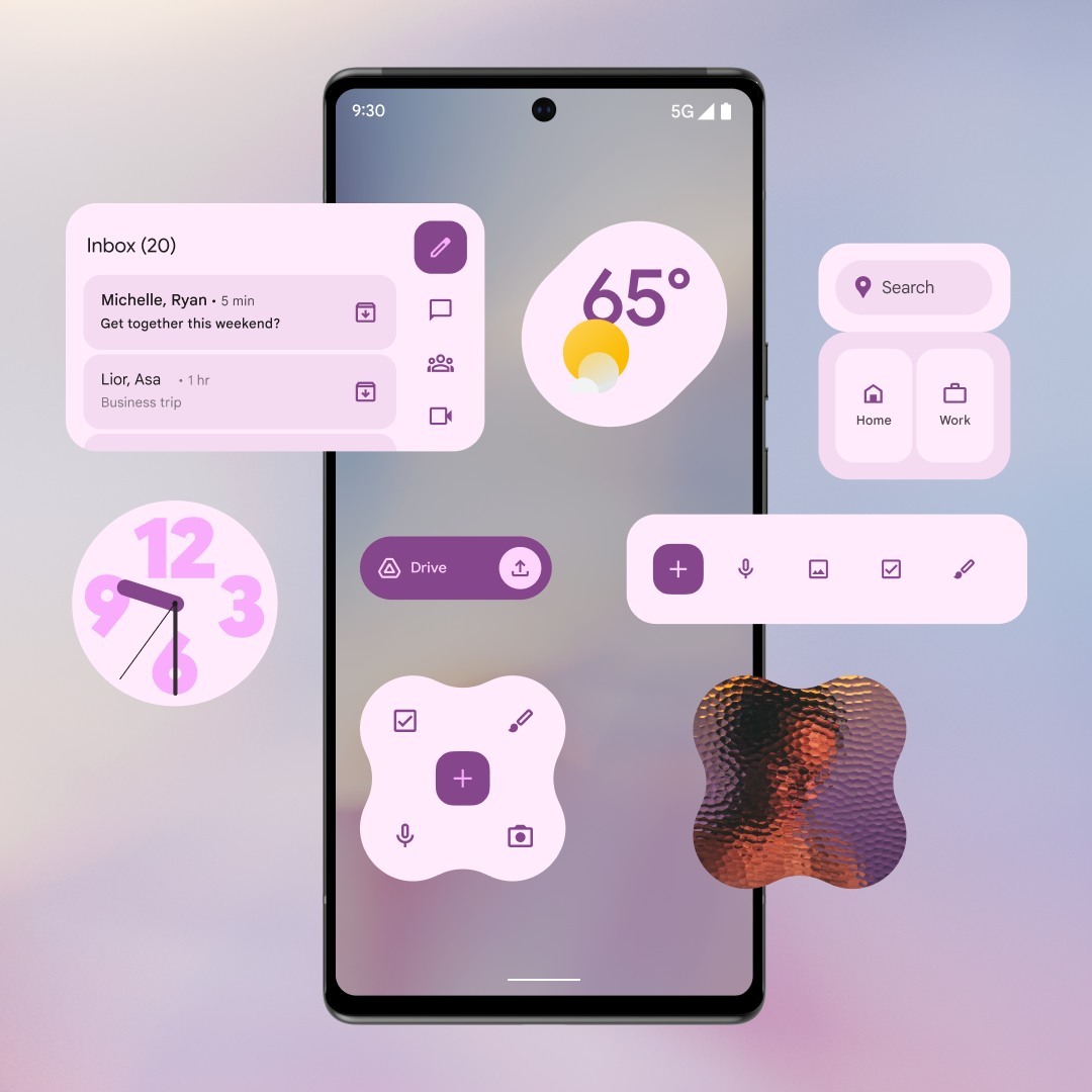
Build anything - deploy everywhere
Watches, medical devices, in-car infotainment, and more. Material UI components work seamlessly across desktop, mobile, and embedded platforms.
Touch-Optimized
Designed specifically for touch interfaces with appropriate touch targets and gestures.
Customizable Themes
Easy theming with Material Theme builder support, allowing you to match your brand colors and design preferences.
Material Design Customization
Tailor the Material Design theme effortlessly to match your brand's identity and requirements, making your app distinct and professional.
Flexible Component Layouts
Explore various layout options with responsive grids, flexible containers, and adaptive components that work across all screen sizes.
Cross-Platform Responsiveness
Ensure your app's optimal performance on various devices and screen sizes, providing a consistent and enjoyable user experience.
Rich Media Support
Seamlessly incorporate images, icons, and multimedia elements that enhance your content and engage users effectively.
Get your Slint application up and running in no time with Material UI.
Step 1: Install Slint
Install Slint and the VS Code extension for the best development experience.
Step 2: Add Material UI
Include Material UI components in your Slint project and start building your interface.
Step 3: Customize Theme
Use the Material Theme builder to customize colors, typography, and component styles.
Ready!
Components
Core Material UI Components
Essential components for building modern Slint applications with Material Design
'%20d='M8%2013v-8.5a1.5%201.5%200%200%201%203%200v7.5'%20/%3e%3cpath%20stroke='url(%23gradient-main)'%20d='M11%2011.5v-2a1.5%201.5%200%200%201%203%200v2.5'%20/%3e%3cpath%20stroke='url(%23gradient-main)'%20d='M14%2010.5a1.5%201.5%200%200%201%203%200v1.5'%20/%3e%3cpath%20stroke='url(%23gradient-main)'%20d='M17%2011.5a1.5%201.5%200%200%201%203%200v4.5a6%206%200%200%201%20-6%206h-2h.208a6%206%200%200%201%20-5.012%20-2.7l-.196%20-.3c-.312%20-.479%20-1.407%20-2.388%20-3.286%20-5.728a1.5%201.5%200%200%201%20.536%20-2.022a1.867%201.867%200%200%201%202.28%20.28l1.47%201.47'%20/%3e%3cpath%20stroke='url(%23gradient-main)'%20d='M5%203l-1%20-1'%20/%3e%3cpath%20stroke='url(%23gradient-main)'%20d='M4%207h-1'%20/%3e%3cpath%20stroke='url(%23gradient-main)'%20d='M14%203l1%20-1'%20/%3e%3cpath%20stroke='url(%23gradient-main)'%20d='M15%206h1'%20/%3e%3c/svg%3e)
Multiple button variants including filled, outlined, and tonal styles for different interaction contexts.
'%20stroke-width='2'%20stroke-linecap='round'%20stroke-linejoin='round'%20class='icon%20icon-tabler%20icons-tabler-outline%20icon-tabler-files'%3e%3cdefs%3e%3clinearGradient%20id='gradient-main'%20x1='0'%20y1='0'%20x2='1'%20y2='1'%3e%3cstop%20offset='0%25'%20stop-color='%233b82f6'%20/%3e%3cstop%20offset='50%25'%20stop-color='%23a21caf'%20/%3e%3cstop%20offset='100%25'%20stop-color='%23ec4899'%20/%3e%3c/linearGradient%3e%3c/defs%3e%3cpath%20stroke='none'%20d='M0%200h24v24H0z'%20fill='none'/%3e%3cpath%20d='M15%203v4a1%201%200%200%200%201%201h4'%20/%3e%3cpath%20d='M18%2017h-7a2%202%200%200%201%20-2%20-2v-10a2%202%200%200%201%202%20-2h4l5%205v7a2%202%200%200%201%20-2%202z'%20/%3e%3cpath%20d='M16%2017v2a2%202%200%200%201%20-2%202h-7a2%202%200%200%201%20-2%20-2v-10a2%202%200%200%201%202%20-2h2'%20/%3e%3c/svg%3e)
Text fields, checkboxes, switches, and other input components for user data collection.
'%20stroke-width='2'%20stroke-linecap='round'%20stroke-linejoin='round'%20class='icon%20icon-tabler%20icons-tabler-outline%20icon-tabler-play-card'%3e%3cdefs%3e%3clinearGradient%20id='gradient-main'%20x1='0'%20y1='0'%20x2='24'%20y2='24'%20gradientUnits='userSpaceOnUse'%3e%3cstop%20offset='0%25'%20stop-color='%233b82f6'%20/%3e%3cstop%20offset='50%25'%20stop-color='%23a21caf'%20/%3e%3cstop%20offset='100%25'%20stop-color='%23ec4899'%20/%3e%3c/linearGradient%3e%3c/defs%3e%3cpath%20stroke='none'%20d='M0%200h24v24H0z'%20fill='none'/%3e%3cpath%20d='M19%205v14a2%202%200%200%201%20-2%202h-10a2%202%200%200%201%20-2%20-2v-14a2%202%200%200%201%202%20-2h10a2%202%200%200%201%202%202z'%20/%3e%3cpath%20d='M8%206h.01'%20/%3e%3cpath%20d='M16%2018h.01'%20/%3e%3cpath%20d='M12%2016l-3%20-4l3%20-4l3%204z'%20/%3e%3c/svg%3e)
Content containers with elevation and various layouts for displaying information in organized, visually appealing ways.
'%20stroke-width='2'%20stroke-linecap='round'%20stroke-linejoin='round'%20class='icon%20icon-tabler%20icons-tabler-outline%20icon-tabler-message-circle'%3e%3cdefs%3e%3clinearGradient%20id='gradient-main'%20x1='0'%20y1='0'%20x2='1'%20y2='1'%3e%3cstop%20offset='0%25'%20stop-color='%233b82f6'%20/%3e%3cstop%20offset='50%25'%20stop-color='%23a21caf'%20/%3e%3cstop%20offset='100%25'%20stop-color='%23ec4899'%20/%3e%3c/linearGradient%3e%3c/defs%3e%3cpath%20stroke='none'%20d='M0%200h24v24H0z'%20fill='none'/%3e%3cpath%20d='M3%2020l1.3%20-3.9c-2.324%20-3.437%20-1.426%20-7.872%202.1%20-10.374c3.526%20-2.501%208.59%20-2.296%2011.845%20.48c3.255%202.777%203.695%207.266%201.029%2010.501c-2.666%203.235%20-7.615%204.215%20-11.574%202.293l-4.7%201'%20/%3e%3c/svg%3e)
Modal interfaces for important actions, confirmations, and detailed information that require user attention.
'%20stroke-width='2'%20stroke-linecap='round'%20stroke-linejoin='round'%20class='icon%20icon-tabler%20icons-tabler-outline%20icon-tabler-navigation'%3e%3cdefs%3e%3clinearGradient%20id='gradient-main'%20x1='0'%20y1='0'%20x2='1'%20y2='1'%3e%3cstop%20offset='0%25'%20stop-color='%233b82f6'%20/%3e%3cstop%20offset='50%25'%20stop-color='%23a21caf'%20/%3e%3cstop%20offset='100%25'%20stop-color='%23ec4899'%20/%3e%3c/linearGradient%3e%3c/defs%3e%3cpath%20stroke='none'%20d='M0%200h24v24H0z'%20fill='none'/%3e%3cpath%20d='M12%2018.5l7.265%202.463c.196%20.077%20.42%20.032%20.57%20-.116a.548%20.548%200%200%200%20.134%20-.572l-7.969%20-17.275l-7.97%2017.275c-.07%20.2%20-.017%20.424%20.135%20.572c.15%20.148%20.374%20.193%20.57%20.116l7.265%20-2.463'%20/%3e%3c/svg%3e)
Drawers, navigation rails, and bottom navigation bars for seamless app navigation and structure.
'%20stroke-width='2'%20stroke-linecap='round'%20stroke-linejoin='round'%20class='icon%20icon-tabler%20icons-tabler-outline%20icon-tabler-layout-navbar'%3e%3cdefs%3e%3clinearGradient%20id='gradient-main'%20x1='0'%20y1='0'%20x2='24'%20y2='24'%20gradientUnits='userSpaceOnUse'%3e%3cstop%20offset='0%25'%20stop-color='%233b82f6'%20/%3e%3cstop%20offset='50%25'%20stop-color='%23a21caf'%20/%3e%3cstop%20offset='100%25'%20stop-color='%23ec4899'%20/%3e%3c/linearGradient%3e%3c/defs%3e%3cpath%20stroke='none'%20d='M0%200h24v24H0z'%20fill='none'/%3e%3cpath%20d='M4%204m0%202a2%202%200%200%201%202%20-2h12a2%202%200%200%201%202%202v12a2%202%200%200%201%20-2%202h-12a2%202%200%200%201%20-2%20-2z'%20/%3e%3cpath%20d='M4%209l16%200'%20/%3e%3c/svg%3e)
Top-level navigation components with actions, titles, and search functionality for your app's main interface.
'%20stroke-width='2'%20stroke-linecap='round'%20stroke-linejoin='round'%20class='icon%20icon-tabler%20icons-tabler-outline%20icon-tabler-loader'%3e%3cdefs%3e%3clinearGradient%20id='gradient-main'%20x1='0'%20y1='0'%20x2='24'%20y2='24'%20gradientUnits='userSpaceOnUse'%3e%3cstop%20offset='0%25'%20stop-color='%233b82f6'%20/%3e%3cstop%20offset='50%25'%20stop-color='%23a21caf'%20/%3e%3cstop%20offset='100%25'%20stop-color='%23ec4899'%20/%3e%3c/linearGradient%3e%3c/defs%3e%3cpath%20stroke='none'%20d='M0%200h24v24H0z'%20fill='none'/%3e%3cpath%20d='M12%206l0%20-3'%20/%3e%3cpath%20d='M16.25%207.75l2.15%20-2.15'%20/%3e%3cpath%20d='M18%2012l3%200'%20/%3e%3cpath%20d='M16.25%2016.25l2.15%202.15'%20/%3e%3cpath%20d='M12%2018l0%203'%20/%3e%3cpath%20d='M7.75%2016.25l-2.15%202.15'%20/%3e%3cpath%20d='M6%2012l-3%200'%20/%3e%3cpath%20d='M7.75%207.75l-2.15%20-2.15'%20/%3e%3c/svg%3e)
Loading spinners and progress bars to provide feedback during operations and data loading.
'%20stroke-width='2'%20stroke-linecap='round'%20stroke-linejoin='round'%20class='icon%20icon-tabler%20icons-tabler-outline%20icon-tabler-bell-ringing'%3e%3cdefs%3e%3clinearGradient%20id='gradient-main'%20x1='0'%20y1='0'%20x2='1'%20y2='1'%3e%3cstop%20offset='0%25'%20stop-color='%233b82f6'%20/%3e%3cstop%20offset='50%25'%20stop-color='%23a21caf'%20/%3e%3cstop%20offset='100%25'%20stop-color='%23ec4899'%20/%3e%3c/linearGradient%3e%3c/defs%3e%3cpath%20stroke='none'%20d='M0%200h24v24H0z'%20fill='none'/%3e%3cpath%20d='M10%205a2%202%200%200%201%204%200a7%207%200%200%201%204%206v3a4%204%200%200%200%202%203h-16a4%204%200%200%200%202%20-3v-3a7%207%200%200%201%204%20-6'%20/%3e%3cpath%20d='M9%2017v1a3%203%200%200%200%206%200v-1'%20/%3e%3cpath%20d='M21%206.727a11.05%2011.05%200%200%200%20-2.794%20-3.727'%20/%3e%3cpath%20d='M3%206.727a11.05%2011.05%200%200%201%202.792%20-3.727'%20/%3e%3c/svg%3e)
Brief notifications that appear at the bottom of the screen to provide feedback and confirm actions.
'%20stroke-width='2'%20stroke-linecap='round'%20stroke-linejoin='round'%20class='icon%20icon-tabler%20icons-tabler-outline%20icon-tabler-info-octagon'%3e%3clinearGradient%20id='gradient-main'%20x1='0'%20y1='0'%20x2='24'%20y2='24'%20gradientUnits='userSpaceOnUse'%3e%3cstop%20offset='0%25'%20stop-color='%233b82f6'%20/%3e%3cstop%20offset='50%25'%20stop-color='%23a21caf'%20/%3e%3cstop%20offset='100%25'%20stop-color='%23ec4899'%20/%3e%3c/linearGradient%3e%3cpath%20stroke='none'%20d='M0%200h24v24H0z'%20fill='none'/%3e%3cpath%20d='M12.802%202.165l5.575%202.389c.48%20.206%20.863%20.589%201.07%201.07l2.388%205.574c.22%20.512%20.22%201.092%200%201.604l-2.389%205.575c-.206%20.48%20-.589%20.863%20-1.07%201.07l-5.574%202.388c-.512%20.22%20-1.092%20.22%20-1.604%200l-5.575%20-2.389a2.036%202.036%200%200%201%20-1.07%20-1.07l-2.388%20-5.574a2.036%202.036%200%200%201%200%20-1.604l2.389%20-5.575c.206%20-.48%20.589%20-.863%201.07%20-1.07l5.574%20-2.388a2.036%202.036%200%200%201%201.604%200z'%20/%3e%3cpath%20d='M12%209h.01'%20/%3e%3cpath%20d='M11%2012h1v4h1'%20/%3e%3c/svg%3e)
Contextual help and information that appears when users hover or focus on interface elements.
FAQs
Frequently Asked Questions
Learn more about Slint Material UI components and how they can enhance your application development.
What platforms does Slint Material UI support?
Slint Material UI works across desktop (Windows, macOS, Linux), mobile (iOS, Android), and embedded platforms, providing consistent Material Design components everywhere.
How do I integrate Material UI into my Slint project?
Simply include the Material UI components in your Slint project, import the components you need, and start building your interface with Material Design principles.
Can I customize the Material Design theme?
Yes! Slint Material UI is fully compatible with Material Theme builder, allowing you to customize colors, typography, and component styles to match your brand.
Slint +
Material UI
Start building beautiful, professional applications today with Material Design components for Slint.